Technology is constantly changing, which means there are always new and better ways of doing things as a web developer. If you haven’t had the chance to mess around with the features of Responsive Web Design, CSS3, and HTML5, then you definitely
are missing out on some great pieces of technology. These new technologies have made web application development even more powerful.
Let’s start with Responsive Web Design. With the growing number of smartphone users, Responsive Web Design has become more popular. This concept brings in many great features, such as an increase in SEO ranking, dealing with one
website, utilizing CSS3 media queries, and adapting for all of the different devices. Users are also getting more content served to them, which in the long run, can save a lot of frustration.
CSS3 Media Queries
You may be wondering what in the world a CSS3 media query is. Well, let me explain because they make mobile web development take on a whole new meaning. There are many different types of media queries that you can use, but I have a few that I prefer to
use.
Below is a media query that will target devices with a high-density display, which is becoming more common.
@media only screen and (-webkit-min-device-pixel-ratio: 2.0),
only screen and (min-device-pixel-ratio: 2.0) {
CSS Styles go here…
}
If you want to specifically target the iPad, this media query will do just that.
@media only screen and (min-width: 768px) and (max-width: 1024px) {
CSS styles go here…
}
With the growing number of tablets and larger smartphones, this media query will target all devices smaller than the iPad.
@media only screen and (max-width: 767px) {
CSS styles go here…
}
There are a few smaller devices out there so we can target those with this media query:
@media only screen and (max-width: 320px) {
CSS styles go here…
}
I generally use “max-width” or “min-width” when setting up my media queries, but you may also see developers use “max-device-width” or “min-device-width.” What’s the difference? “Max-width”
and “min-width” refer to the width of the display area or the browser width and “max-device-width” and “min-device-width” refer to the actual screen size of the device.
To get all of these media queries to work the way you want them to, be sure to use the following meta tag. This is the one I use, but there are other settings you can apply when using this tag.
<meta name="viewport" content="width=device-width, initial-scale=1.0" />
The meta tag above tells the browser to make the web pages the width of the device, which will make web pages adjust and display correctly when viewing in portrait or landscape. You will also notice the scale is set, which is just telling
the browser to render the web pages at the scale you want. In this case, its “1.0.”
You can also serve different images according to the type of device, which might be high-density display devices or just simply a device that falls within the media query you have defined. When I do this, I prefer to us the “Picturefill”
concept. This idea is based on the HTML5 picture element, but with limited support, this is the alternative. You can take full advantage of this concept from scottjehl on GitHub.
With this concept, you can create images at different widths and heights to target the appropriate devices. This way, users aren’t downloading bigger images than necessary. Let me explain.
To enforce support for the “data-media” attribute across all browsers, you must call the matchmedia.js, then the picturefill.js, which is what appends the “<img/>” tag to the correct “<span></span>”
tag based on the “data-src” value that matches, in the head of your HTML document.
If you are ready to get started then take a look at the examples below, based on the demos from scottjehl on GitHub.
<span data-picture data-alt="Alternative text goes here">
<span data-src="/images/original.jpg"></span>
<span data-src="/images/image_768.jpg" data-media="(max-width: 768px)"></span>
<span data-src="/images/image_640.jpg" data-media="(max-width: 640px)"></span>
<span data-src="/images/image_480.jpg" data-media="(max-width: 480px)"></span>
<span data-src="/images/image_375.jpg" data-media="(max-width: 375px)"></span>
<!-- Fallback content for non-JS browsers. Same img src as the initial, unqualified source element. -->
<noscript><img src="/images/original.jpg" alt="Alternative text goes here" title=“Title can go here” width="874" height="384" /></noscript>
</span>
Again, with the increase of devices with high-density displays, it’s important to add this media query to your markup.
<span data-src="/images/large_x2.jpg" data-media="(-webkit-min-device-pixel-ratio: 2.0), (min-device-pixel-ratio: 2.0)"></span>
There is also the option to target Internet Explorer for desktop, but only if you feel the need, because media queries are not supported in Internet Explorer 8 and older.
Below is the conditional comment from scottjehl on GitHub that will serve, in this case, a larger image to Internet Explorer desktop. Just add this to your
markup with the other media queries you have defined.
<!--[if (lt IE 9) & (!IEMobile)]>
             <span data-src="large.jpg"></span>
         <![endif]-->
CSS3 Styles
CSS offers more than just media queries. There is a whole new list of styling options to achieve the proper visuals when developing a website. You can apply anything from rounded corners, 2D or 3D transformation, or even those fabulous drop shadows that
seem to add a little touch. Let’s get started with some examples.
Below is an example for applying rounded corners to an element.
-webkit-border-radius: 1px;
-moz-border-radius: 1px;
border-radius: 1px;
Why not add a little rotation? Apply the properties below to make an element rotate to 90 degrees.
-webkit-transform: rotate(90deg);
-moz-transform: rotate(90deg);
-ms-transform: rotate(90deg);
-o-transform: rotate(90deg);
transform: rotate(90deg);
Now, what would a website be without a little drop shadow? Try this out and see what you can do.
-moz-box-shadow: inset 0 0 12px #cccccc;
-webkit-box-shadow: inset 0 0 12px #cccccc;
box-shadow: inset 0 0 12px #cccccc;
Of course, there are bowsers that still don’t support features of CSS3, but it doesn’t mean you can’t use them. I always try to keep in mind what the fall back will be if a browser doesn’t support a CSS3 feature I have
implemented. If the fall back still looks good without completely destroying the design, then go with it, as long as you or the designer are happy. You may notice the “-webkit(Chrome & Safari),” “-moz(Firefox),” or even
“-o(Opera)” tags when applying some of the different properties. These are currently the prefixes that have to be used so these browsers’ different versions will implement the properties that you are trying to use.
HTML5
HTML5 brings in a whole new meaning to semantics. It allows you to structure the outline of the HTML document in different ways, and that can be done using explicit or implicit sectioning. There is obviously more to HTML5 than just this, but these are
a couple significant benefits.
You may be wondering what the difference is between explicit and implicit sectioning. According to the HTML5 Cookbook, explicit sectioning is when a new section is introduced in the outline by using “section” and
“aside,” and the headings within each section form the outline for the content. Implicit sectioning is where you rely solely on heading ranking for the outline of the HTML document.
Below is an example of explicit sectioning, which helps define your HTML document outline in a whole new way.
<section>
<h1>Main Title</h1>
<article>
<h2>Subheading</h2>
<p>Put some content here.</p>
</article>
<article>
<h2>Subheading 2</h2>
<p>Content goes here.</p>
</article>
</section>
Below you will see an example of implicit sectioning where you have one section tag around everything and then rely on headings to create the document outline.
<section>
<h1>Main Title</h1>
<h2>Subheading</h2>
<p>Put some content here</p>
<h3>Subheading</h3>
<p>Content goes here.</p>
<h2>Subheading</h2>
<p>Put some content here.</p>
</section>
If you are interested in viewing the outline of your HTML5 documents, you can try out the HTML5 Outliner. If you see anywhere that it says untitled section in the outline
of your document, there is a chance you might be using the tags incorrectly—but some elements, such as the “nav” element, don’t require a heading.
You can implement the example below to get you started making your
HTML5 document with the tags that are required.
<!DOCTYPE html>
<html>
<head>
</head>
<body>
<header>
<nav>This is where your navigation would go.</nav>
</header>
<h1>Main Heading</h1>
<section>
<h2>Content Subheading</h2>
<p>This is some text.</p>
</section>
<section>
<h2>Content Subheading</h2>
<p>This is some text.</p>
</section>
<footer> This is where your footer content would go.</footer>
</body>
</html>
As you have seen, there is a lot you can do with Responsive Web Design, CSS3, and HTML5. I hope this encourages you as a web developer. Or maybe you aren’t a web developer and would like to become one. Either way, this is a great
start to becoming more involved in the world of web development because the possibilities are endless. Obviously, I only explained the beginning of what these technologies can offer you as a web developer so I encourage you to dive in and start having
some fun!
Learn about our latest Responsive Web Design projects:
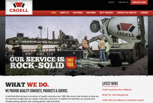
Croell Redi-Mix

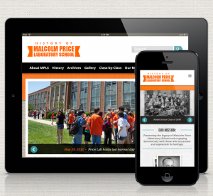
Price Lab History
